|
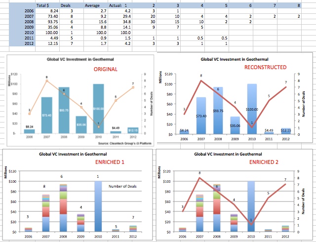
Pictured below are four graphs (and the associated data). The first is the ORIGINAL graph as published in a recent e-newsletter I received. Beside it is my Excel RECONSTRUCTED version. What I do not like about these graphs is that there is addition and valuable data that has been left out: the value of each deal that make up the total for a given year. My ENRICHED 1 and 2 endeavour to include this information (although I interpolated it, not having access to the actual data). In the case of the ENRICHED graphs, one can immediately see that all the deals in 2006, 2011 and 2012 were small and that the one deal in 2010 is clearly an exception. This of course could be correctly estimated by calculating averages from the ORIGINAL graph. However in the cases of 2007, 2008 and 2009, an average alone is insufficient. For example in 2007, there were 8 deals with an average of just over $9 million each, but the ENRICHED data shows that there were three large deals (approximately $30, 20 and 10 million) and a further 5 small deals (average of $3 million each).  Of course to develop the ORIGINAL graph with its consolidated totals, one would have had to collect individual deal size data and add it up. My question is why not display it? In doing so more data and information is available to the reader, and I don't feel the ENRICHED graphs are significantly more complex. Look at the two types of graphs; ORIGINAL consolidated and ENRICHED, and ask yourself: What are the trends in VC investment? Which graph type is a better aid? (Personally I like ENRICHED 1.) The Pareto or 80-20 rule is a rule of thumb that things such as "about 80% of sales comes from 20% of your customers", "about 80% of complaints come from 20% of the people", "about 8o% of sales come from 20% of the products", and "80% of your effort should be directed to your top 20% of priorities." The Pareto rule is related to a statistical distribution of the same name. According to Wikipedia, quality-management guru Joseph Juran (who I heard speak in Toronto years ago) suggested that this rule be named after Italian economist Vifredo Pareto (1848-1923). One good example of the Pareto rule is the distribution of economic activity, measured by Gross Domestic Product (GDP) in the world. The top 23 countries account for 80% of total world GDP (see file/ graph and map). The take home message of the 80-20 rule is that one should focus on those customers, products, or activities that account for the majority of profits, and not to get distracted by the minor ones.
Litemind at http://litemind.com/ is an excellent website setup and run by Luciano Passuello in Brazil. Check it out! Perhaps the most valuable item on his website is the free e-book (upon registering) entitled "The Very Best of Litemind." This book is full of great ideas. I have drawn a Mind Map of it.
|
Decision AnalysisThoughts and interesting articles on decision making and creative thinking. Archives
March 2017
Categories |
||||||||||||

 RSS Feed